The Architecture of a Page
With the launch of PageBuilder 2, a new layer of information is now accessible to Punchmark clients. In our first version, only the elements were editable, which was good for adding in new content, creating pages from templates, and creating landing pages for shoppers.
As these were built via a template system, the architecture of the page was more or less in place. If a client wanted to add additional parts to the page, then it would require a Punchmark Team member to edit the code directly. That is no longer the case. Punchmark built the PageBuilder 2 interface to be able to build (with the right know-how and technical experience) any other website that exists on the Punchmark platform.
With enough practice, exploration, and courage, a client can realistically rebuild any homepage they want from the comfort of their own home.
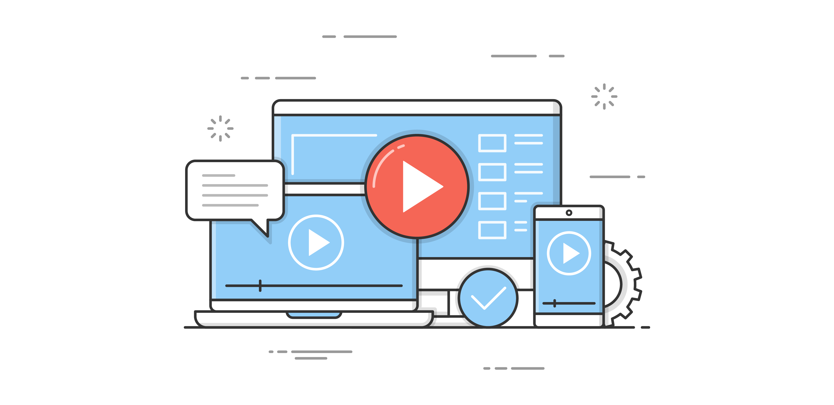
There are some basic concepts you will need to understand about how websites are built to begin to grasp the way PageBuilder works. Punchmark's codebase uses Bootstrap as its backbone, and that is what Pagebuilder creates using. Michael does his best to explain this concept visually.
About Levels

PageBuilder 2’s interface changes depending on which level the user is interacting with. These levels form a hierarchy with nesting effects. These can be accessed independently at the top of your logged in interface.

Elements
The level that users will be interacting with the most frequently is the Elements level. This is the layer that will be accessed any time a user selects anything on the page. Previously, elements were the only accessible item and that editability has not been changed - only enhanced. To list out all of the settings and variables available for each would take a lot more words than anyone would care to read, instead we will give an overview of each type.
Depending on the Element that is selected, your PageBuilder interface will change. There are five basic types of Elements: Images, Headers, Paragraphs, Links, and WYSIWYGs. Depending on the widget type that is selected, some may be missing or there may be duplicates of each.
- Images - If no image has been added yet, a placeholder will be used. You can then insert an image from FileManager that will crop itself to the size of the placeholder.
- Headers - These will take on the styling from your Design > Typography section in SiteManager. The contents can be edited either on the page or through the interface.
- Paragraphs - These will take on the styling from your Design > Typography section in SiteManager. The contents can be edited either on the page or through the interface.
- Links - Also known as Buttons, these can be given a page to link to when selected. These will take on the styling from your Design > Buttons section in SiteManager.
- WYSIWYG - Pronounced wizywig, and an acronym for “What You See Is What You Get”. This element is a wild card. Users familiar with HTML and CSS can use inline styling to create their own custom layouts and styling. If this seems intimidating, just stick with the other types.
Widgets
The widget file will do most of the work in creating the unique functions of your section. Widget files are essentially malleable templates that can handle additional styling and unique javascript for each component. This means that they can dynamically perform tasks such as pulling in products from categories, social media feeds, or SiteManager settings.
These starting templates all begin with a basic layout, usually employing a headline, paragraph, and some type of placeholder image. By default, most Sections will load in as the default widget (with an image, then header, then paragraph font, then link), but can be changed by navigating to the widget level in the hierarchy bar and changing the widget type by selecting “Choose”.

Depending on the widget type, sometimes additional information will be required which will populate on the side bar. Which product category you want your Product Slider Widget to pull from or which social media account you want your Social Feed Widget to pull from will be choosable from the sidebar interface. If you have questions about how a specific widget works, select the Learn More button on the Choose a Widget Template interface to read more about what the intended purpose is.
Columns
The main contributing factor to how “busy” your Section is, Columns are the vertical segments that make up a Section.
Each row contains a total of 12 columns. Setting the Column Size will change the width of the column and decrease the number of available columns for others to take up.
This can be visualized via the sidebar interface that displays when a column is selected.

There are unique “break-points” that are predetermined by the size of the device that the page is viewed on. This is important because the width (number of pixels, or more blatantly, the inches of display glass), changes depending on the device that is being used.
The sizes of each breakpoint are:
XS - Smartphone held vertically (most common breakpoint)
SM - Smartphone held horizontally (least common breakpoint)
MD - Tablet or iPad held vertically (very common shopping device view)
LG - Tablet or iPad held horizontally, desktop monitor (2nd most common breakpoint, most common shopping device view)
Think of the size of your smartphone versus the size of a tablet versus the size of a desktop monitor. They are VERY different sizes so the layout of your page should change depending on device in order to stay legible.
A majority of Rows are symmetrical on desktop size, and look best when the 12 columns are divided evenly. For Example, 2-column rows typically have each Column taking up 6 each, for an even split down the middle column on desktop (LG) views.
However, mobile elements are typically stacked into either 2-column or single column rows. The average internet user has become comfortable with scrolling more now than 10 years ago - due to the prevalence of Infinite Scrolling sites popular in social media (ex. Twitter, Instagram, Facebook).

Rows & Sections
Less commonly used, Rows are the horizontal components of your Section. Sections are the biggest size blocks that sit on the Page. They stack one on top of the other, typically starting with a banner directly under the Navigation Bar, and ending just above the Footer.
Pages
The entire page level can be accessed by selecting the X in the Breadcrumb Bar and exiting the editing mode. From this level, entire Sections can be dragged and dropped onto the page, and placed between existing Sections.
