Marketing experts (and website companies) are always talking about how your website should be another arm of your store’s business. The fact of the matter is that your website is more like an additional entity, with a personality, mannerisms, language, and anatomy all its own… though closely related to your store’s brick and mortar location.
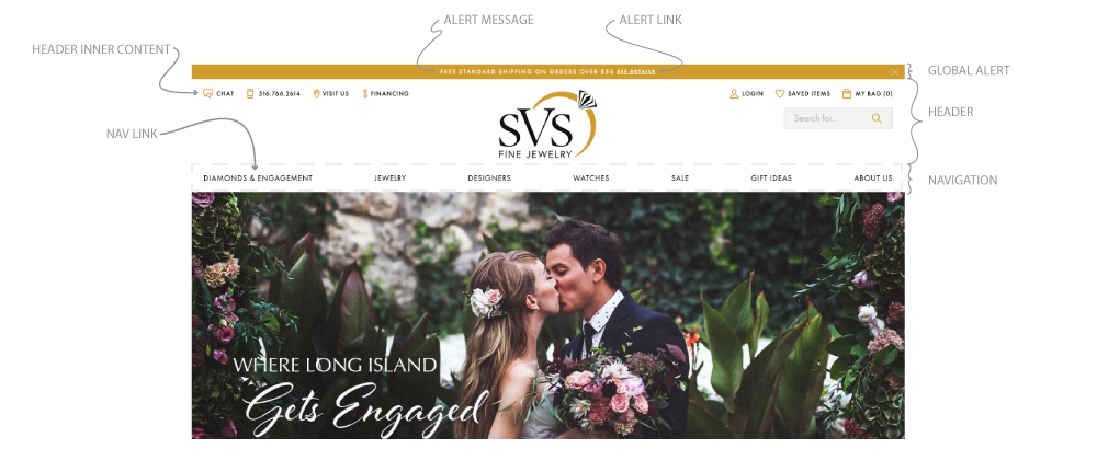
Although the homepage is the most important page, the most important part of the entire site is the global header. The header is the main tool for getting around your site. Let’s take a closer look at the parts of your global header.

You will find that many sites have a global header with variations or alterations to the example above. However, upon closer look you will find the same components available nearly without exception (for E-Commerce sites). With the exception of the global alert and the inner content, nearly every piece is a necessity.
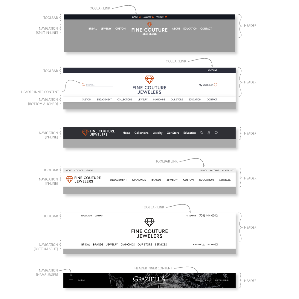
In the following example, you will see the multitude of ways a Header can be executed while maintaining similar content.
What can be confusing is that many people refer to the entire top section of their website as the Header. While not incorrect, it can lead to confusion when trying to dive deeper into more complex topics such as User Experience (UX), Branding, and User Interface (UI) Design. By ensuring a rich vocabulary, we ensure a stronger foundation from which to strategize.
It’s not just jewelry websites that have this anatomy. Let’s look at some other top-performing e-commerce sites.
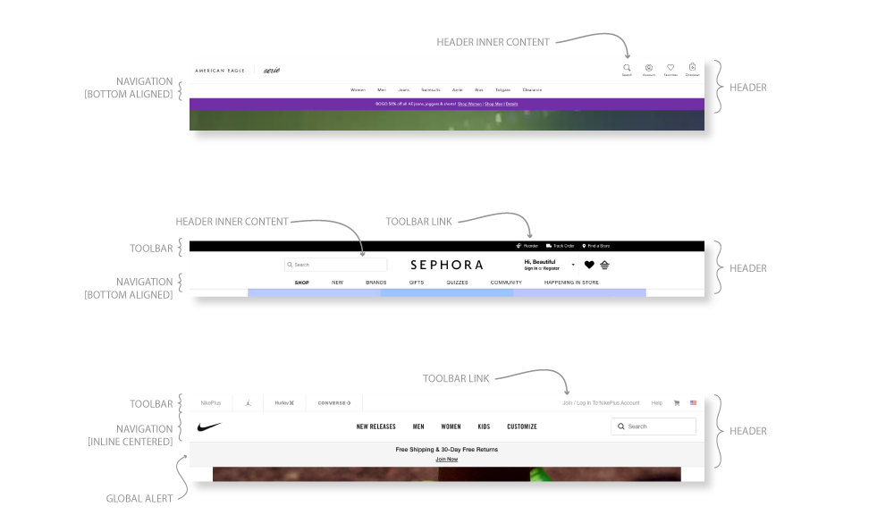
The most noticeable similarity between these website’s headers is the clear hierarchy of importance. The branding (logo or logomark) is reduced so that the importance of the main navigation links is elevated.
Secondary and tertiary links are moved off to the side so as not to clutter up the more important primary links. The Search, Global Alert, and Toolbar are prominent but also work to frame the most important content.
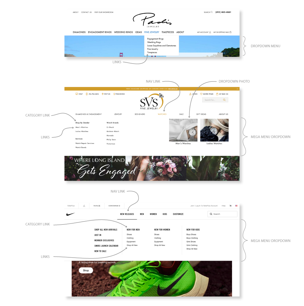
The final differentiating factor for your Header is each link’s dropdown menu (if it has one). A major divergence is if they have a standard linear Dropdown Menu or a Mega Menu.
The linear Dropdown Menu is straight forward, using the Nav Link as the Category Link. You can clearly draw a direct connection between the dropdown itself and the category.
The Mega Menu, on the other hand, offers a more creative relationship between Nav Link and the Links themselves. Major e-commerce brands spend months categorizing their products to maximize the user’s shopping experience.
By being creative with your Mega Menu’s layout, you will reduce bounce rate and keep shoppers on your site longer, increasing your chances of a sale. To start implementing these changes and maximizing your Header’s potential, follow these steps:
1. Clearly identify what your goal is with your website. Do you want to sell Engagement Rings or Encourage them to Start a Custom Project or something else entirely?
2. Encourage users to proceed toward that identified goal. Include language and links that clearly lead to those end goal areas.
3. Look at websites you find to be well made and identify what makes them stand out.
4. Contact Punchmark and together we will create your Header’s new layout.
Long past is the days where simply having your website convey your business’s hours of operation and location. To optimize your business’s web presence, offering an omnichannel (definition: a type of retail that integrates the different methods of shopping available to consumers) solution by integrating your Brick & Mortar’s personality with your web presence is the path to a successful and growing business.
This post was written by Punchmark's Lead UI/UX Designer, Micheal Burpoe.
Mike graduated from the Rochester Institute of Technology and is also an outdoor and plant enthusiast. In his spare time you can find him running, practicing Brazilian Jiu Jitsu or designing for his own startup, BUZZ Gear. He is detail-oriented and won't stop until his design is perfect! He's originally from Saranac Lake, way up in the Adirondack region of Northern New York.